Exploring the Art of Poster Design: A Guide to Poster Typography
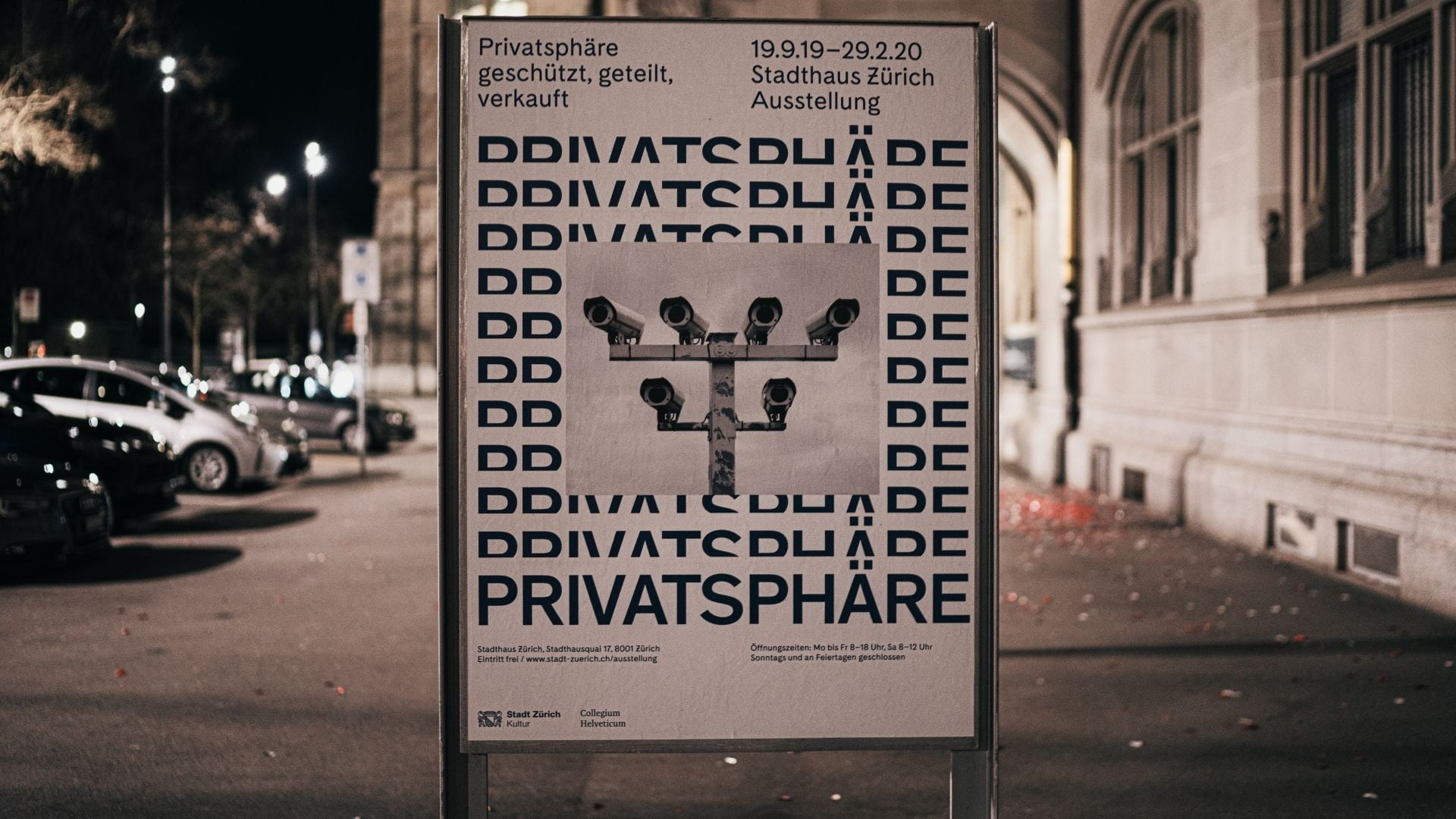
Typography is a crucial element of poster design that can greatly influence how a message is conveyed to the audience. When you make a poster with Vista Create, it’s crucial that you choose the right typography for your design.
The art of poster typography goes beyond selecting fonts; it involves understanding the visual impact of different typefaces, arranging text harmoniously, and using typography as a powerful design element. In this comprehensive guide, we will delve into the world of poster typography, exploring tips and techniques to create visually stunning and effective poster designs that leave a lasting impression.
Understanding Typography Basics
Font Families and Types
Typography comprises various font families, each with its unique characteristics. Common font types include serif, sans-serif, script, display, and decorative. Serif fonts have small lines at the ends of characters, making them suitable for traditional and formal designs. Sans-serif fonts, on the other hand, lack these lines, providing a modern and clean look.
Font Pairing
Pairing fonts is an essential skill in any type of design. Combining two or more fonts that complement each other creates visual interest and ensures readability. A contrast in font styles, such as pairing a bold font with a delicate one, can make certain elements stand out.
Hierarchy and Emphasis
Typography establishes a hierarchy of information, guiding the viewer’s attention. Use font sizes, weights, and styles to create emphasis and direct focus on essential elements, such as the main message or call to action.
Typography Techniques for Effective Posters
1. Keep it Simple and Legible
In poster design, simplicity is key. Avoid using too many fonts or overwhelming the audience with complex typography. Ensure that the chosen fonts are legible from a distance, as posters are often viewed from various distances.
2. Align and Organize
Maintain consistent alignment and organization of text elements. Align headings, subheadings, and body text properly to create a structured and professional appearance. Use different sizes, fonts, and text formatting to draw attention to the most important information. Make sure that the most important points are noticeable at once and create a hierarchy to move the viewer’s eyes to the details.
3. Use Contrast
Adding contrast to your design can help create visual impact and enhance readability. Play with font weights, sizes, and styles to establish clear distinctions between different levels of information.
4. Balance Text and Visuals
Balance the use of text and visuals in your poster design. Avoid overcrowding the poster with text, and let the words and images complement each other. Depending on the amount of text and the size of the images, you can select different orientations for your creation. If your idea is text-heavy, go for a vertical design, and if you want to present information with images, a horizontal one may work better.
5. Experiment with Layout
Don’t be afraid to experiment with different text layouts. Try asymmetrical designs, creative text paths, or combining typography with graphic elements for a dynamic and engaging poster. Play with negative space to make your design stand out.
6. Consider Color
Color is a powerful tool in typography. Choose colors that harmonize with the overall design and evoke the right emotions in the audience. Ensure that the text color contrasts well with the background for readability.
7. Test for Readability
Before finalizing the design, test the poster’s readability. Print a mock-up or view it on a screen from various distances to ensure that the typography remains clear and legible. Ask other people for their opinion on the design as sometimes it gets difficult to see the whole picture after you’ve been working on it for a while.
Conclusion
Typography is a fundamental aspect of poster design, capable of influencing the visual appeal, readability, and effectiveness of the message. By understanding its basics, mastering font pairing, creating hierarchy, and applying various techniques, you can elevate your poster designs to a new level of creativity and impact.
Remember to keep the typography simple, legible, and balanced with the visuals. Experiment with layout, color, and contrast to make your poster stand out and leave a lasting impression on your audience. So, embrace the art of poster typography, and let your creativity speak through the carefully crafted letters and words that grace your poster designs!


